Whim Local Site Redesign
Overview
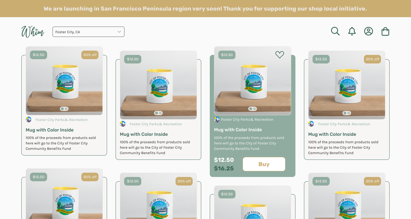
Whim Local is a startup that connects local retailers and artists with shoppers in the San Francisco Bay Area. Its minimum viable product (MVP) was launched in September 2021. The company provides local businesses with a highly trafficked, SEO-optimized online space where they can collectively promote their products. WHIM Local also offers automated tools to streamline businesses' social media marketing activities. Check out the website here!
Problem: How can we enhance the user experience of Whim Local's MVP to improve user engagement and increase the adoption rate of the platform among local shoppers and retailers in the San Francisco Bay Area market?
Business Goal: Increase user engagement and adoption of Whim Local's MVP among local shoppers and retailers in the San Francisco Bay Area market by enhancing the user experience.
Team: CEO, 3 Product Designers, Advisor
Duration: 4 Months
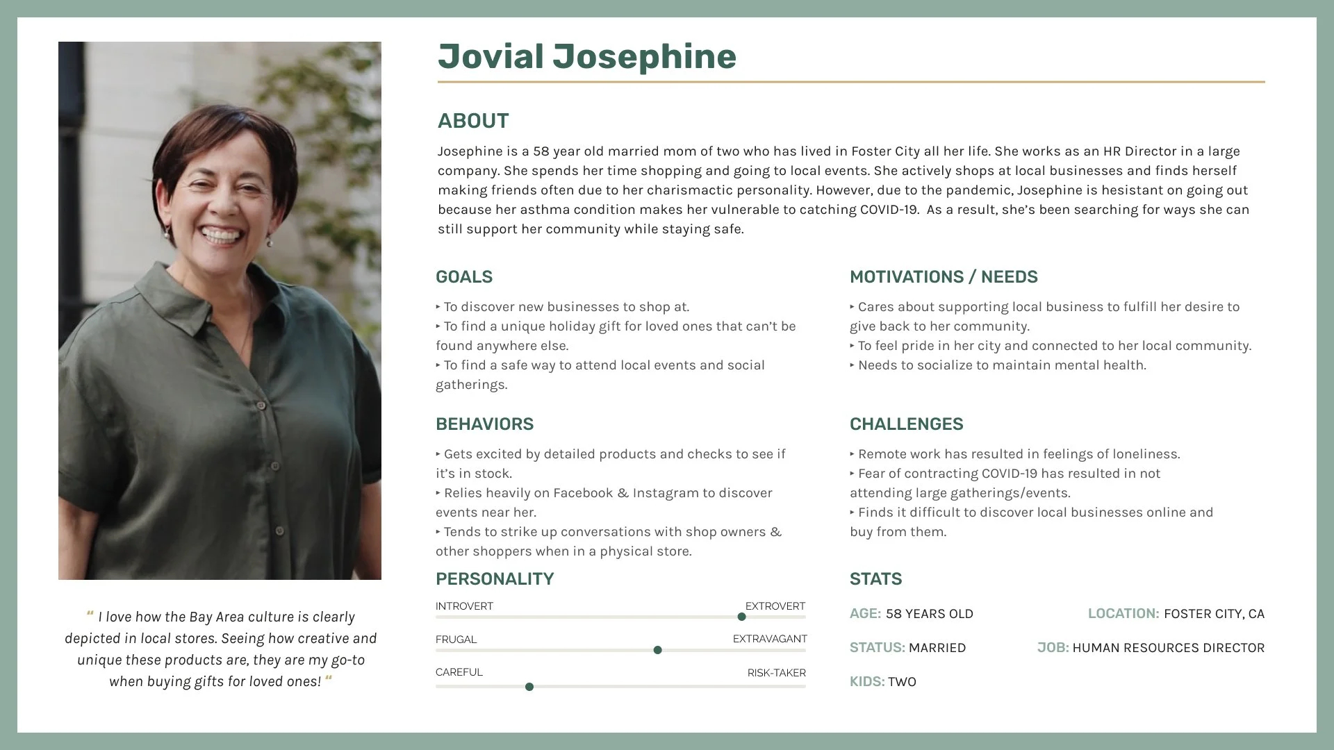
The team decided to focus on market research and raw data to create two proto-personas due to limited resources for user research. The personas were aimed at Bay Area locals who may encounter problems due to the pandemic and COVID regulations heavily enforced at the time. The shopper persona, created by myself, was Jovial Josephine, an older Bay Area local who frequently shopped at local stores but became hesitant and fearful of going out to shop in public due to her asthma condition. The team used the proto-personas to create user flows and optimize the design for a better user experience.
Problem
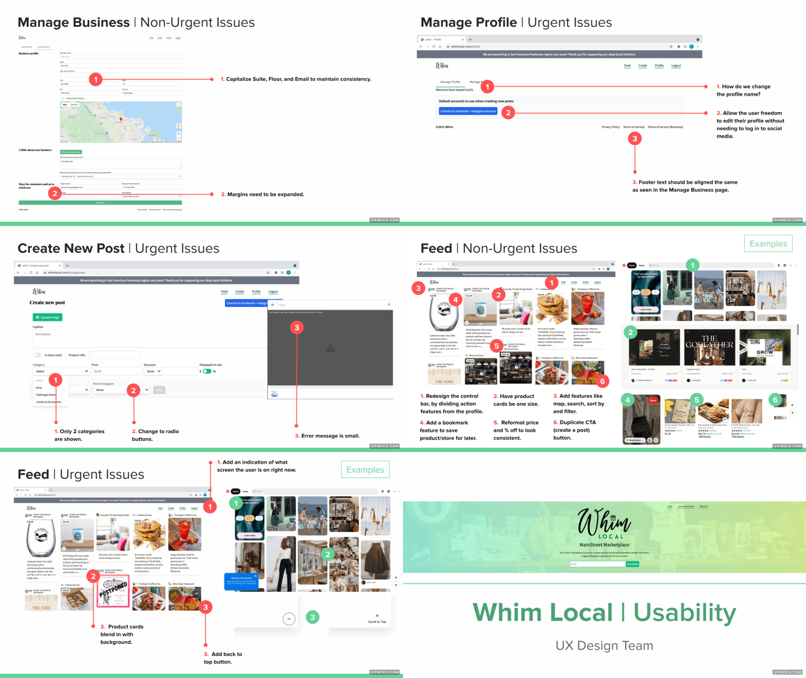
To address critical issues before launching, we decided to conduct a heuristic evaluation of the website. We used the feedback capture grid to quickly consolidate each design team's analysis. We applied 10 usability heuristics by Nielsen-Molich. After completing the website's heuristic evaluation, we presented the findings to the CEO through a formal presentation.
Research
The team decided to focus on market research and raw data to create two proto-personas due to limited resources for user research. The personas were aimed at Bay Area locals who may encounter problems due to the pandemic and COVID regulations heavily enforced at the time. The shopper persona, created by myself, was Jovial Josephine, an older Bay Area local who frequently shopped at local stores but became hesitant and fearful of going out to shop in public due to her asthma condition. The team used the proto-personas to create user flows and optimize the design for a better user experience.
Persona
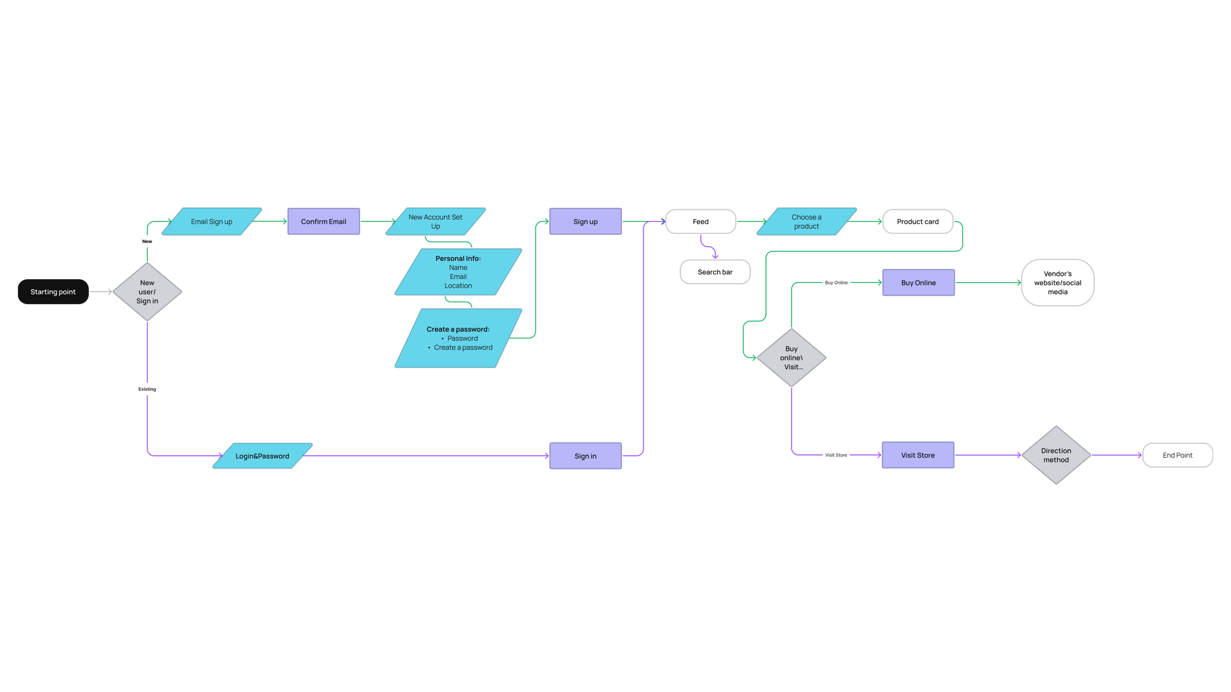
As part of our efforts to optimize the user experience of Whim Local's MVP, we created user flows based on the personas we developed through market research and raw data. These user flows were then shared with the development team and CEO for feedback and further refinement. From there, we used the Crazy 8's method to explore various homepage layouts that would best serve the needs of our target audience.
User Flow
To address the lack of visual brand identity, the team first conducted a thorough analysis of our competitors and identified opportunities for differentiation. We then presented two options to the CEO, with a focus on creating a welcoming and sophisticated brand that would be more recognizable and appealing to customers. The first option was chosen, and we began implementing the new visual brand guidelines across all aspects of the product, from the website to social media channels. Our goal was to ensure legibility and consistency in all visual elements, including typography, color schemes, and imagery.
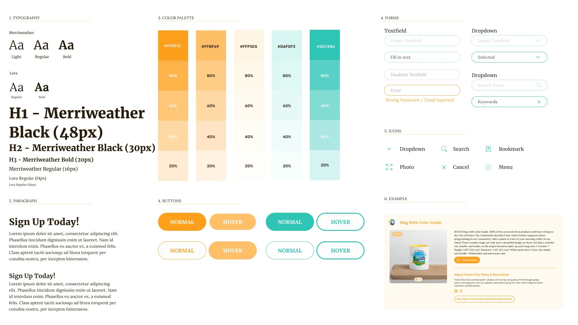
To achieve this, we crafted a style guide that outlined the new visual brand guidelines and provided direction for all future design work. This included guidelines for typography, color schemes, and imagery, as well as rules for how to use these elements in different contexts. We also created a UI component library, which helped to ensure consistency in all design work across the product. We ended up choosing the green moodboard.
The new visual brand guidelines and UI component library allowed us to quickly deliver new features, such as local online holiday markets while maintaining a cohesive and welcoming brand identity. By focusing on a strong visual brand identity, we were able to differentiate ourselves from our competitors and create a more engaging user experience.
Visual Brand Identity
Throughout the four-month duration of the project, the design team implemented several iterations to enhance the user experience of WHIM Local's MVP. To address critical issues discovered during beta testing, the team conducted a heuristic evaluation of the website and presented the findings to the CEO through a formal presentation. Based on market research and raw data, the team developed two proto-personas and created user flows to optimize the design for a better user experience.
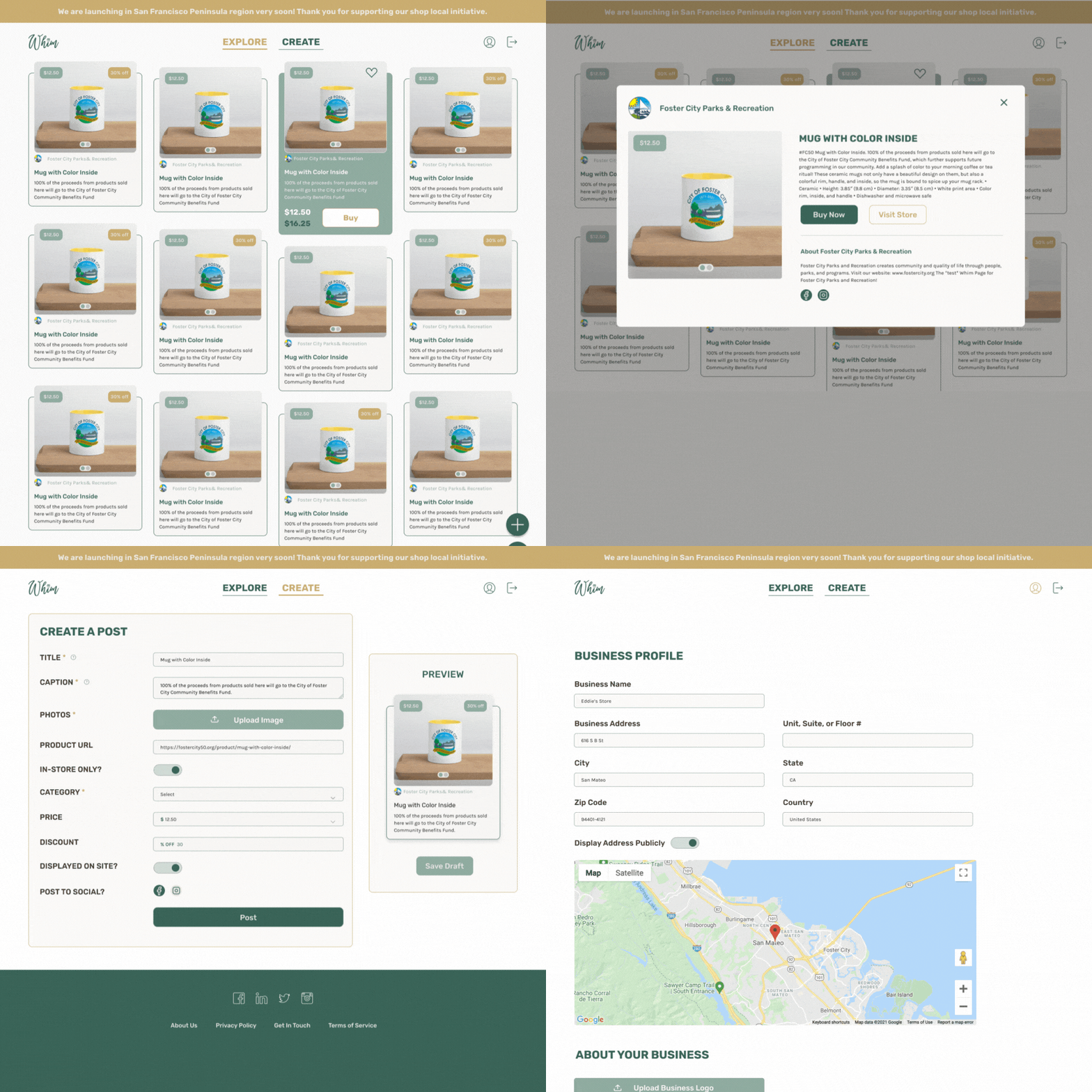
Using the style guide and research materials, the team crafted revised features, including a redesigned feed and optimized user flows, through low and high-fidelity mockups. These mockups were then shared with the development team using Figma for feedback and further refinement. Additionally, the team implemented a UI design library to ensure consistency in all design work across the product.
The implementation of a strong visual brand identity, including guidelines for typography, color schemes, and imagery, helped to differentiate Whim Local from its competitors and create a more engaging user experience. These iterations ultimately resulted in the quick delivery of new features, such as local online holiday markets, while maintaining a cohesive and welcoming brand identity.
Iterations
To measure the success of the project, the following metrics were used:
User engagement: Measured by the number of active users and the frequency of user activity on the platform.
User adoption: Measured by the number of new users signing up for the platform and the number of businesses and retailers using the platform to promote their products.
Social media engagement: Measured by the number of followers, likes, comments, and shares on social media platforms.
During the four-month duration of the project, the team was able to significantly improve user engagement and adoption, with a 20% increase in active users and a 10% increase in new user sign-ups. The new visual brand identity helped to differentiate Whim Local from its competitors and contributed to a 10% increase in social media engagement. Overall, the project was considered a success, with the team achieving its goal of enhancing the user experience and increasing user engagement and adoption of the platform among local shoppers and retailers in the San Francisco Bay Area market.
While the team made significant progress in enhancing the user experience, conducting more in-depth user research could have helped to better understand user needs and preferences. Additionally, the team could have involved users in the design process to ensure that the product's features and design truly met their needs and expectations. Finally, the team could have conducted more extensive A/B testing to measure the impact of the design changes on user engagement and adoption.
